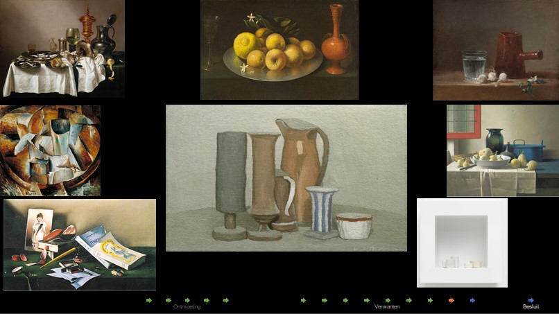
Ontmoeting
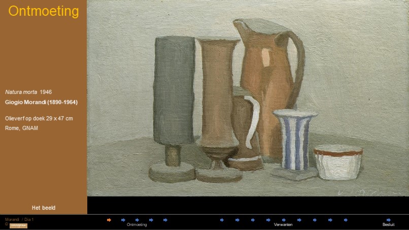 1. Stilleven 1946
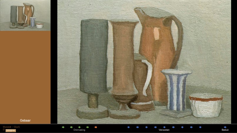
Zes voorwerpen op een doek. Netjes in het midden. Twee slanke hoge vormen die misschien olielampjes zijn. Opzij, meer naar achteren de hoogste en grootste vorm, een kan. Van rechtsvoor dringt een rijtje van drie, steeds hogere, tussen de olielampjes en de kan door. De eerste is het laagst en breed, een kommetje. Dan komt een soort vaasje met een rare vierkante voet. De derde is ook een kan, aan het hengsel te zien, die verdwijnt achter het rechtse olielampje. Ze staan op een vaag tableau van bijna dezelfde kleur als de achtergrond, het zou een ronde tafel kunnen zijn.
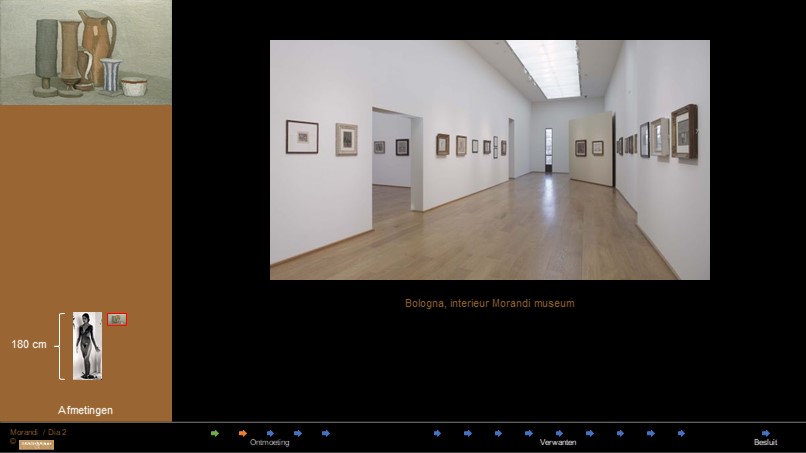 2. Afmetingen
Zonder uitzondering zijn Morandi’s werken klein. De meeste halen net geen 40 cm breed en de grootste kleiner dan 60 cm. Bij een verhouding van 3: 4 wil dat zeggen dat het niet hoger kan zijn dan 36 cm. En dat is goed te zien op deze foto van het museum in Bologna, waar Morandi vandaan komt. Het kleine formaat vraagt van de toeschouwer om zich sterk te concentreren en zich te isoleren van alle afleiding uit de omgeving. Het werk is bedoeld voor een persoonlijke beleving.
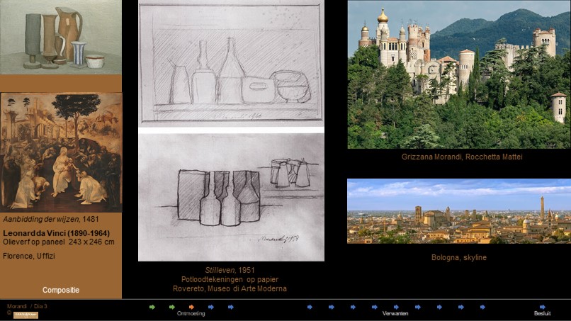 3. Compositie
De compositie van het werk is sterk architectonisch. De vormen doen eerder denken aan gebouwen dan aan wat de voorwerpen echt zijn. Dat komt door de manier waarop ze gerangschikt zijn.
De ruimte waarin de voorwerpen staan opgesteld is niet begrensd en als er een rand te zien is van de plank of tafel waarop ze staan, doet die zich voor als een horizon. Het zijn voorwerpen in een landschap, zoals de Italiaanse dorpsgezichten die Morandi zo goed kende. Ze staan dicht tegen elkaar en overlappen gedeeltelijk. Hun basis is solide.
In de tekeningen is duidelijk zichtbaar dat voor Morandi de tussenruimtes even belangrijk waren als de vormen van de voorwerpen zelf. De compositie laat de ingewikkelde driehoek composities van Leonardo en de grote Italianen los en beperkt zich tot een lineaire opstelling, van links naar rechts, op een denkbeeldige vloer, voor een nauwelijks zichtbare horizon. Op die manier zijn de composities nauwer verwant aan onze eigen leefwereld en minder aan het theatrale schilderij.
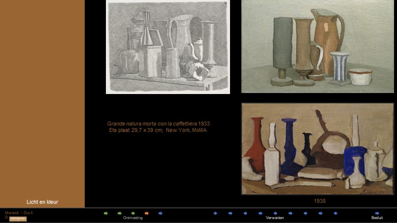 4. Licht en kleur
Op de eerste plaats is Morandi geïnteresseerd in de verdeling van het licht. Dat zien we op de ets. In ons schilderij is het licht erg diffuus en komt van schuin-linksvoor. Hij onderzoekt hoe de schaduwen van het ene voorwerp over het andere voorwerp vallen, hoe het licht het ene voorwerp van het andere onderscheidt. Maar er is geen echte lichtinval zoals bij Vermeer of andere grootmeesters uit het verleden. Je kunt vermoeden dat er stof ligt op de voeten van wat ik olielampjes noemde en op de onderste rand van het kapje van het rechter lampje.. Dat komt door de afwijkende kleur. Maar het is ook weer dezelfde kleur als de schaduw in de tuit van de kan. Verwarrend.
In zijn vroege werk gebruikt hij een enkele keer harde, tegengestelde kleuren, maar over het algemeen hanteert hij een zacht palet. Daardoor worden de voorwerpen echter, ding-achtiger, zonder fotografisch te zijn. Ze krijgen een eigen karakter terwijl ze zich losmaken uit hun contour en ze doen massiever aan.
 5. Gebaar
Een oneindig aantal richtingen van de kwast en het penseel accentueert de vormen. Het gebaar is uiterst precies en nauwkeurig, en desondanks tegelijkertijd bijzonder gevarieerd. Het is er juist zo dat wij met het gebaar de vorm kunnen volgen en het voorwerp bijna beet kunnen pakken. Maar dan onttrekt het zich plotseling aan zijn eigen bijna-echtheid en trekt zich terug in het doek, in een oplossen van de plastiek die overgaat in plat zijn. Het doet soms denken of het voorwerp door het doek heen steekt en aan de achterkant te zien moet zijn. De vezels van het schilderdoek overheersen de stofuitdrukking die niet duidelijk maakt of de voorwerpen van tin zijn, of van aardewerk, of misschien van hout. Hoe langer je kijkt, des te sterker wordt het architectonische karakter, de illusie van bouwsels op afstand waarvan de grootte nauwelijks te schatten is.
Verwantschap
Laten we eens kijken naar een paar verwanten.
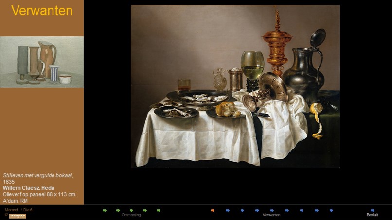 6. Heda
Het is een wonder dat Willem Claeszoon Heda niet leefde in de tijd van de fotografie. En hij is nog steeds een voorbeeld voor veel fotografen en fotografie vakscholen en workshops. Het heeft alles wat een stilleven tot een stilleven maakt: uitgewogen compositie, boeiende lichtval, zinvol arrangement van voorwerpen, precieze nabootsing en in zijn geval: overtuigende stofuitdrukking. Voorwerp eigen stofuitdrukking is precies waar Morandi van af ziet.
 7. Zubarán
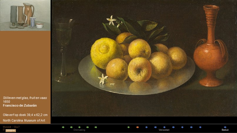
In dezelfde tijd als Heda maar buitengewoon ingetogen combineert Zubaran de natuur met drie ambachtelijke producten, glas – van glas, een schenkkan van aardewerk en schaal van tin. Deze drie schikken zich naar de duistere achtergrond. Het licht is vooral voor de vruchten en de bloemen. Die verlichting brengt onderschikking aan, de natuur is belangrijker dan ambachtelijke producten. Het is tegengesteld aan Morandi die zijn licht juist gebruikt om nevenschikking te bereiken.
 8. Chardin
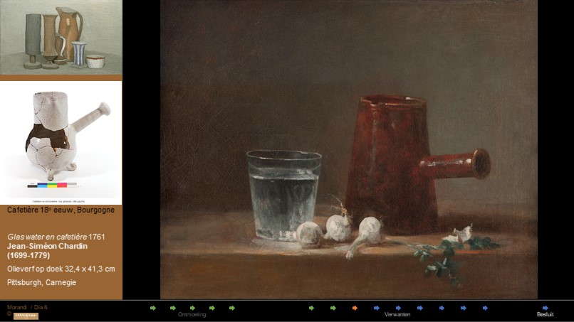
Morandi had verschillende foto’s naar Chardin in zijn atelier aan de muur. Hier doet het begrip verstilling zijn intrede. Natura morta, noemen wij stilleven. Het betekent feitelijk ‘dode natuur’. Ook al zien de knoflookbolletjes er nog goed uit, ze zijn net van de streng gesneden. Je vraagt je af of deze combinatie van water, knoflook en koffie een speciale betekenis heeft.
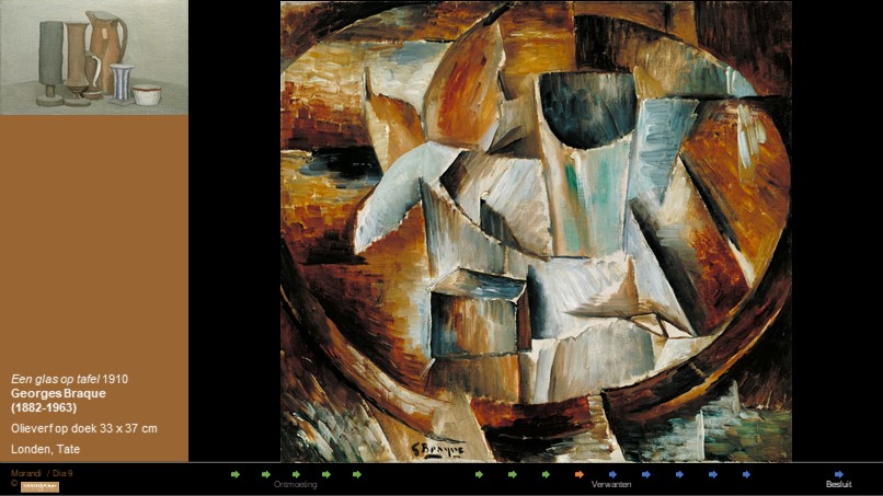 9. Braque
In de twintigste eeuw, en wel speciaal in de tijd van Morandi, ontwikkelen Braque en Picasso een kubistische opvatting van het stilleven. Daarin proberen zij verschillende aanzichten van een voorwerp gelijktijdig te laten zien. Tientallen zogenaamde stillevens zijn van hen bekend. Morandi waagde zich er niet aan.
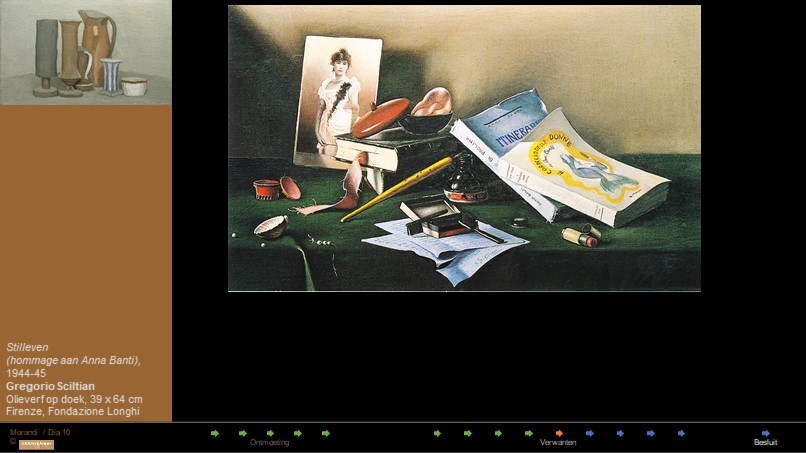 10. Sciltian
Een landgenoot en tijdgenoot van Morandi specialiseerde zich in het Trompe-l'oeil, ofwel het bedrogen oog. Net echt, zouden wij zeggen of sterker nog: dit is gezichtsbedrog. Ambachtelijk buitengewoon knap maar Morandi streefde het niet na.
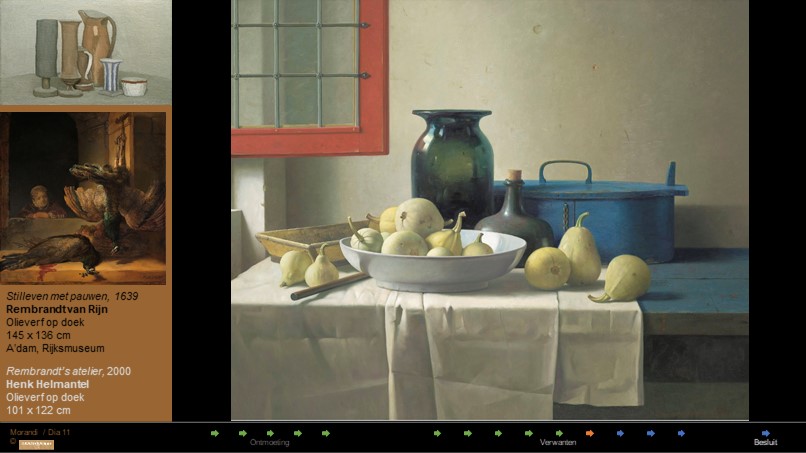 11. Helmantel
Dit grote stilleven van Helmantel kreeg een knipoog in zijn titel mee. Rembrandt maakte slechts één stilleven, nog groter dan die van Helmantel, wat een erg ongebruikelijk formaat is. Maar we weten uit al zijn andere schilderijen dat Rembrandt een meester was in het weergeven van ‘dingen’. Helmantel betrapte hem ook in zijn stilleven op het open raam: Bij Rembrandt staan we buiten, bij Helmantel staan we binnen. Bij beiden komt het licht van buiten.
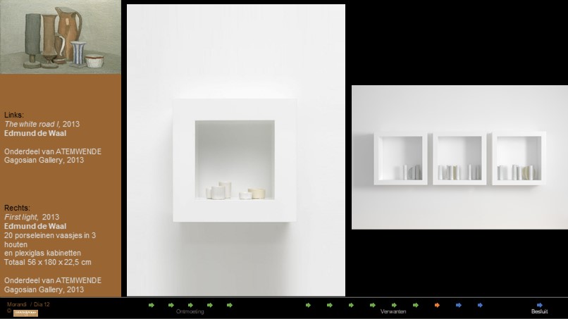 12. De Waal
Een driedimensionaal stilleven wordt gepresenteerd door Edmund de Waal, een van de beroemdste pottenbakkers uit Engeland. Niet alleen het grote werk rechts, dat een onderdeel is van 22 installaties, maar vooral het intieme “The White Road I, doet denken aan Morandi. Elk potje is met groot gevoel gedraaid. Niets is toevallig. Elk element bevestigt het totaal. Wordt er eentje verschoven dan raakt het geheel verstoord. Aanraken en verplaatsen maakt de totale herschikking noodzakelijk. Dat zie je en dat voel je. Het maakt het kunstwerk tot een gedicht, waarin elk woord zijn eigen onvervreemdbare plaats kreeg toegewezen.
 13. Alle 8
Wanneer je alle acht verwanten bij elkaar zet ontdek je wat elke kunstenaar uniek maakt. Morandi heeft het meest ingehouden kleurenpalet. Tot aan De Waal, die 65 jaar later komt, heeft hij ook de minste verscheidenheid aan vormen. Terwijl in alle andere stillevens een strijd gaande is, welke vorm en kleur het belangrijkst is, bereikt Morandi een bijna volmaakte harmonie, in de vormen, in de kleuren, in het licht en in de compositie.
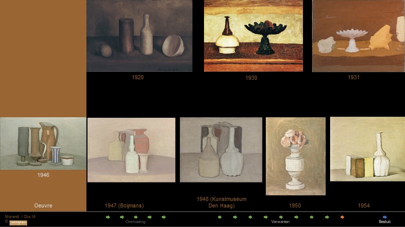 14. Oeuvre
Op de website van museum Boijmans van Beuningen, dat een Morandi uit 1947 in zijn collectie heeft, staat de volgende tekst:
“Dat figuratieve kunst nagenoeg abstract kan zijn, bewijzen de stillevens van Morandi. Met ijzeren consequentie schilderde hij telkens nieuwe arrangementen van dezelfde armoedige potjes en flesjes. Al doende liet hij zien hoe rijk en gevarieerd zulke composities kunnen zijn, en hoeveel er voor de liefhebbers van vorm en kleur aan dit soort minimalisme te beleven valt. Eenvoud was voor Morandi een bron van zuivere schoonheid”.
(Boijmans) einde citaat.
Het zijn zware woorden, ‘nagenoeg abstract, ijzeren consequentie, armoedige potjes en minimalisme’ Het zijn niet direct de woorden die in je opkomen als je dit werk bekijkt. Het is een conclusie over een heel oeuvre, waarvoor je het hele oeuvre moet kennen. Het museum loopt vooruit op een stroming die Morandi nog niet kon kennen: het minimalisme was in 1956 nog niet uitgevonden. Misschien is Morandi er de belangrijkste wegbereider van.
Besluit
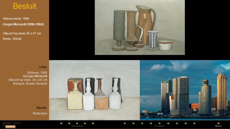 15. Besluit Stilleven 1946, 1956 en skyline Rotterdam
Schoonheid is iets dat vastgelegd moet worden. Als een kunstenaar ontdekt wat voor hem of haar werkelijke schoonheid is, kan hij of zij dat niet meer loslaten. Voor Morandi lag er zeker schoonheid in de gebouwde omgeving. Je kunt bij hem beter spreken over landschap, horizon en ruimte, over nevenschikking, onderschikking en identiteit, dan over stilleven. Morandi kende de stillevens van Chardin, van Cézanne, van Van Gogh, van Picasso en van Braque, maar hij zocht zijn eigen schoonheid. Die bouwde hij op met zijn eigen modellen, als de skyline van een levende stad.
Bronnen
1) Mandarte cursus Verwantschap (2011)
2) Google Arts
https://artsandculture.google.com/asset/natura-morta-giorgio-morandi/CgHn1UExbC3Sew
3) Bilbao
https://giorgiomorandi.guggenheim-bilbao.eus/en/exhibition
Morandi and the Still-Life Tradition
Morandi’s enthusiasm for Spanish Golden Age art coincided with the rediscovery in Italy of its principal masters. The critic and art historian Roberto Longhi, whom Morandi admired and later befriended, had already drawn attention in his writings to Diego Velázquez and Francisco de Zurbarán. In 1930, Longhi curated the exhibition Gli antichi pittori spagnoli della collezione Contini-Bonacossi at the Galleria Nazionale d’Arte Moderna in Rome. The Contini-Bonacossi Old Master collection, the largest in Italy, included a magnificent set of Spanish pictures by El Greco (Domenikos Theotokopoulos), Bartolomé Esteban Murillo, Velázquez, and Zurbarán. In his introduction to the catalogue, Longhi stressed the particular importance of the exhibition for contemporary artists, which explained the decision to hold it at Italy’s leading modern art museum, and he described Zurbarán as the “greatest constructor of forms with light, following Caravaggio and anticipating Cézanne,” declaring him a “proto-modern” artist.
Although he never mentioned any Spaniards among those who had influenced his work, Morandi’s interest in Spanish Golden Age painters was evidenced by a revealing episode centered on El Greco that took place in 1918 or 1919. The literary critic Giuseppe Raimondi recalled paying a visit to Morandi’s home, where the artist had a small book on El Greco open. Pointing to a reproduction of an Assumption or an Annunciation the size of a postage stamp, he indicated some flowers at the feet of the angels and the saints, saying: “No modern painter has painted flowers like these. Perhaps only Renoir.” As epitomes of the modern, Morandi found the Spanish masters to be kindred spirits.
Morandi: A New Incamminato
When the art historian Roberto Longhi began teaching at the University of Bologna in 1934, he designed a general course on the history of the Bologna school from the Middle Ages to the present day. The following year, he published that history with the title Momenti della pittura Bolognese. Longhi maintained that the dominant characteristic of Bolognese painting was the immediacy and expressiveness of its interpretation of naturalism. According to his history, the heroes of Bolognese art were the three Carracci brothers, Agostino, Annibale, and Ludovico. The Carracci—Baroque painters active toward the end of the sixteenth and the beginning of the seventeenth centuries—were the leaders of a modern pictorial style constructed on the basis of established artistic traditions. It is significant that he should have concluded his analysis with Giorgio Morandi, describing his work as that of a new incamminato, or one who is advancing along a path. Longhi stressed the fact that Morandi explored the past to find his path through the “most troublesome droughts” of modern painting.
Morandi never explicitly praised the art of his native city. Nevertheless, he did pay close attention to his Baroque precursors and other later influences. The Bolognese Seicento focused on daily life and represented its most humble aspects, and it was fundamental to the development of genre painting in Italy between the sixteenth and eighteenth centuries. While Morandi’s work should arguably not be classified as genre painting, since he eliminated picturesque elements from his images in a quest for a deeper understanding of the objects themselves, the artist seems to have responded to this Italian tradition in his representation of everyday scenes. This speaks to the important role artists from Bologna as well as Northern Italy played in Morandi’s painting. Shown in this room are a selection of such artworks from his personal collection.
Space and Matière: Chardin and Morandi
Among the Old Masters, Morandi openly revered and applauded the French genre painter Jean-Baptiste Siméon Chardin. When first studying Chardin, Morandi could well have encountered the article published in 1911 by the art critic Henri des Pruraux in the avant-garde journal La Voce, in which the author claimed that Chardin had invented the modern self-referential still life. In 1932, the periodical Valori Plastici distributed André de Ridder’s amply illustrated monograph in Italy. Morandi tacked reproductions from this book on the walls of his studio so as to have them constantly in sight as examples. These illustrations allowed Morandi to gain insight into Chardin’s artistic process. The French master worked in series with different variations, and he recycled objects he owned in his artworks. Morandi also adopted these strategies, returning time and again to the same jugs, bowls, bottles, and boxes, making slight alterations to their arrangements.
Chardin continued to resound throughout Morandi’s career. In his 1960 interview with the critic Edouard Roditi, the artist described him as “the greatest painter of still life” because “he never relied on trompe-l’oeil effects. On the contrary, with his pigments, forms, sense of space, and what the French critics call his matière, he managed to suggest a world that interested him personally.” In Chardin, Morandi found someone in history who was a true equivalent, concerned with the same issues: the first artist to tackle the question of painting in itself through a specific genre—the still life—with the goal of understanding its full potential.
Morandi’s Landscape (1927): Looking at Paul Cézanne
Morandi spent his summers in his studio in Grizzana, tucked away in the Emilian hillside. His idyllic surroundings influenced works such as his Landscape of 1927, which evokes the rich tradition of landscape painting that came before him.
In Landscape Morandi reimagines his studio through the eyes of artists such as Paul Cézanne (b. 1839, Aix-en-Provence; d. 1906, Aix-en-Provence). In its contrasting tones of greens, greys, and browns, it resembles Cézanne’s The House with the Cracked Walls, which was reproduced in a book on Cézanne published in the same year that Morandi created this scene. Even in black and white, it is easy to appreciate the quick tonal shifts across the surface of the Cézanne.
Reproductions in black and white also informed Morandi’s etching practice, which provided him with another medium through which to explore the subjects of his paintings. In his 1927 Landscape, Morandi uses this technique to see his Grizzana studio in a new light.
Morandi’s Still Life (1952): Looking at Lorenzo Costa and Giovanni Bellini
Morandi’s still lifes often suggest an entire world with a few objects. In paintings such as his Still Life from 1952, that world was Bologna, the city where he lived and rarely left.
The bottles, vases, and boxes grouped together in this work resemble the rooftops and towers of Morandi’s native city. Bologna was represented in several paintings that Morandi could have seen in the National Pinacoteca of Bologna, including Madonna and Child Enthroned between Saints Petronius and Tecla by Lorenzo Costa (b. 1460, Ferrara; d. 1535, Mantua). The city-in-miniature in Saint Petronius’ hands reveals the interplay of forms that make up the Bolognese skyline and that reappear in Morandi’s still life.
Morandi most probably studied similar cityscapes in paintings by other Italian artists, such as St. Jerome in the Desert by Giovanni Bellini (b. ca. 1430, Venice; d. 1516, Venice). Formerly in the famous collection of Florentine collector Alessandro Contini Bonacossi, it is now in the Uffizi Gallery, a museum that Morandi visited often when in Florence.
Morandi’s Still Life (1956): Looking at Francisco de Zurbarán through Francisco de Goya y Lucientes
As with his Still Life of 1956, Morandi’s paintings were mostly simple arrangements of everyday objects. In its modest subject matter, this still life follows the long tradition of depicting life in the kitchen.
The formal connections are clear between this work and the kitchen scenes by painters such as Giuseppe Maria Crespi (b. 1665, Bologna; d. 1747, Bologna) and especially Francisco de Zurbarán (b. 1598, Fuente de Cantos; d. 1664, Madrid). Its palette of browns, greys, and whites recalls canvases by these artists that Morandi could have seen at exhibitions in Italian museums.
Morandi rediscovered artists such as Zurbarán through the eyes of Francisco de Goya y Lucientes (b. 1746, Fuendetodos; d. 1828, Bordeaux). In 1956, Morandi went to Winterthur, Switzerland for the inauguration of his exhibition at the local art museum. While there, he saw Three Salmon Steaks in the renowned collection of Oskar Reinhart. The dramatic lighting and humble subject of this still life suggest that Goya shared Morandi’s admiration for the Spanish Golden Age.
4) MoMA
In Large Still Life with Coffeepot, Morandi used the etching needle in his typical fashion to define forms through meticulous layers of hatched and cross-hatched lines. His carefully modulated tonalities coalesce into an architectonic composition that invites careful inspection and meditation. The ethereal lighting creates an atmosphere of restrained emotion and pregnant, almost eerie, stillness.
5) Antieke Cafetière
https://patrimoine-culturel.gouv.qc.ca/rpcq/detail.do?methode=consulter&id=156131&type=bien
Fonctions / usages :
La cafetière ou chocolatière est un récipient utilisé pour le service et la consommation des aliments.
La terre cuite de la faïence culinaire de type terre à feu présente des propriétés particulières qui lui permettent de résister à la chaleur : pas au contact du feu lui-même, mais à une température qui correspond à une cuisson lente à chaleur douce, ainsi qu'au service des mets ou de liquides chauds conservés à proximité immédiate du foyer. Les traces de chauffe sur les pieds de la verseuse témoignent d'une telle utilisation. Quant à savoir s'il s'agit d'une chocolatière ou d'une cafetière, seul le couvercle aurait permis de distinguer la fonction : celui de la chocolatière est percé d'une ouverture pour laisser passer le moussoir.
Lieu de production : Europe > France > Bourgogne > Nevers
Type de fabrication :Artisanal
Technique de fabrication : Moulé Tourné
Matériaux : Céramique - terre cuite fine (Faïence blanche)
Dimensions : Diamètre extérieur (Mesurée / intégral) : entre 7,3 et 11 centimètre(s)
Hauteur : 17,6 centimètre(s) Largeur (Mesurée / intégral) : 20 centimètre(s)
Intégrité :
Objet complet constitué de plusieurs fragments recollés ou non (75% et plus de l'objet)
6) Rembrandt stilleven
In Rembrandts tijd waren pauwen voedsel voor de welgestelden; het vlees werd onder meer in pasteien verwerkt. Na de slacht moesten de dieren hangend uitbloeden, wat Rembrandt hier in deze voorraadkamer laat zien. Hij was zonder twijfel geboeid door de prachtige tekening op de verentooi, de weelde aan kleuren: blauw, groen en okergeel.
Stilleven met pauwen. Een meisje leunt op het kozijn van een stenen venster kijkt naar twee dode pauwen. Een pauw hangt aan het openstaande vensterluik, de andere ligt op een stenen plint bij een plas bloed; op de plint staat ook een mand met fruit.
7) Edmund de Waal Atemwende
https://www.edmunddewaal.com/making/atemwende
Deze tentoonstelling van 22 installaties in galerie Gagosian, New York, was tot nu toe de grootste tentoonstelling van Edmund de Waal en zijn eerste met de galerie. De titel van de tentoonstelling is ontleend aan Paul Celan's poëziecollectie Atemwende uit 1967, een term die de dichter gelijkstelt aan het moment waarop woorden de letterlijke betekenis overstijgen. Een groot deel van de tentoonstelling was een gesprek met de poëzie van Celan en de Waals denken over muziek en architectuur.
8) Over Paul Celan
Trouw 2011
https://www.trouw.nl/nieuws/ten-noorden-van-de-toekomst~b182eb1f/
Abonneren
Rapporteer
Mijn reacties